What?
In this case study, I aimed to redesign the Denver Zoo Conservation Alliance's purchase ticket flow. This case study includes user testing, competitive research, and multiple iterations of interactive prototypes. The final outcome is a efficient ticket flow, with simplistic visuals and clear directions.
For this project I was the sole researcher and designer, in charge of user testing, competitive research, and multiple iterations of interactive prototypes. Along with guidance from Brittney Urich VanHorssen and James Tran.
Who?
Why?
The Denver Zoo's current purchase ticket flow is overwhelming and confusing at time. I aimed to simplify the process while keeping all the required interactions and their design system.
User testing
Current Denver Zoo Experience
Affinity mapping pain points
I conducted testing with a group of prescreened users to identify current pain points. Common problems included overwhelming screens, confusing order of tasks, and feeling there was missing information. This made an opportunity create a clear step by step process, informing the users along the way.
Competitive analysis
For research, I conducted a competitive analysis of the Denver Zoo ticket purchase flow versus other competitors. I identified multiple competitors where one would buy a ticket to an experience. I used this information to decide on the most important features to include in my redesign.
How might we...
How might we make the website less overwhelming?
How might we help the customer make an informed decision?
How might we make the ticket buying process more efficient?
Problem statement
Zoo visitors need an efficient way to buy tickets online because the current process is too time consuming
User flow
To plan the redesign, I created a user flowchart using Figma FigJam to map out the ticket buying experience. The user flowchart is valuable to see the entire flow and make sure I have all the required steps. This planning beforehand helps me optimize the user experience by proactively addressing potential issues before development.
Low fidelity wireframes
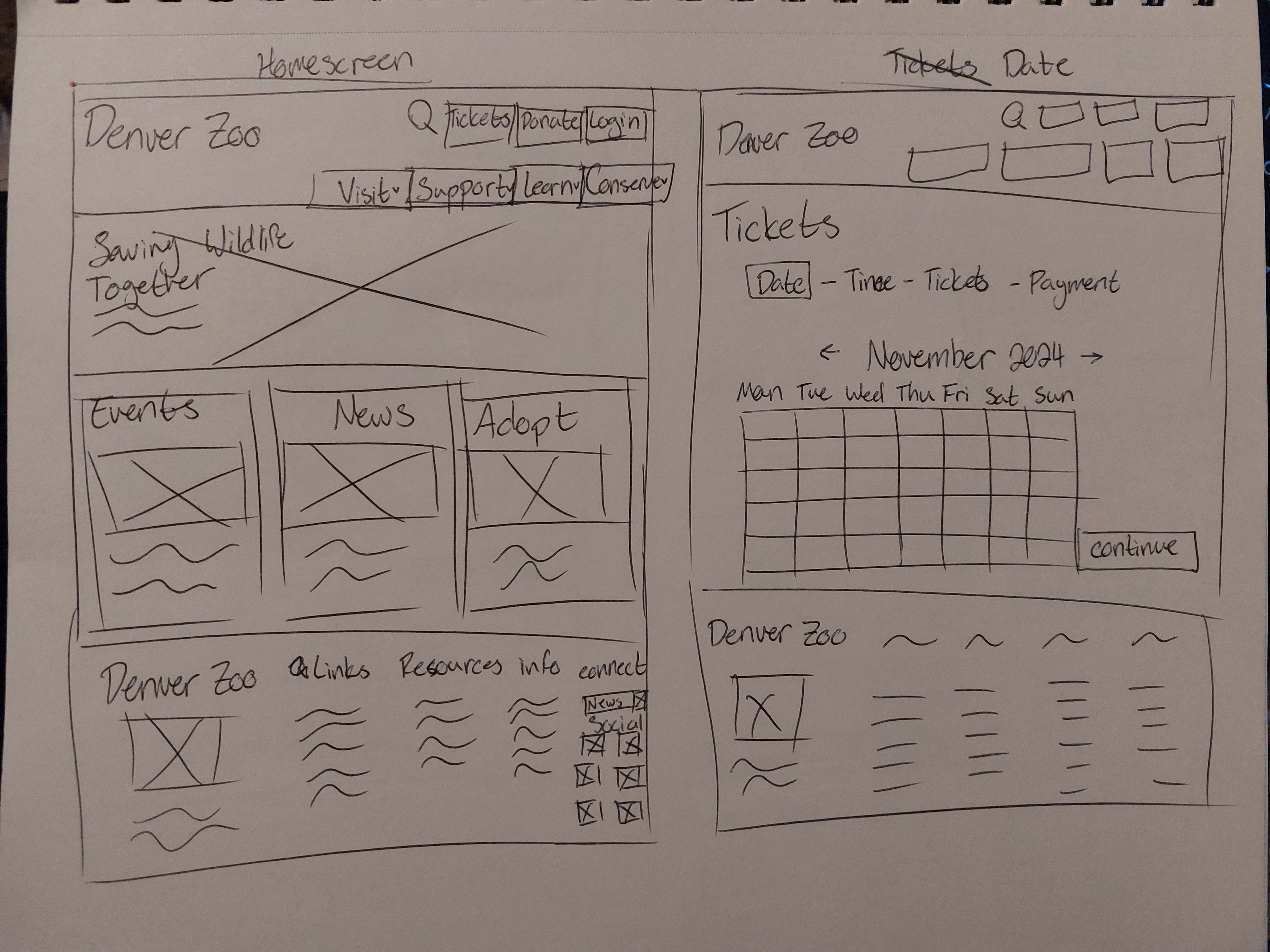
Home screen and date
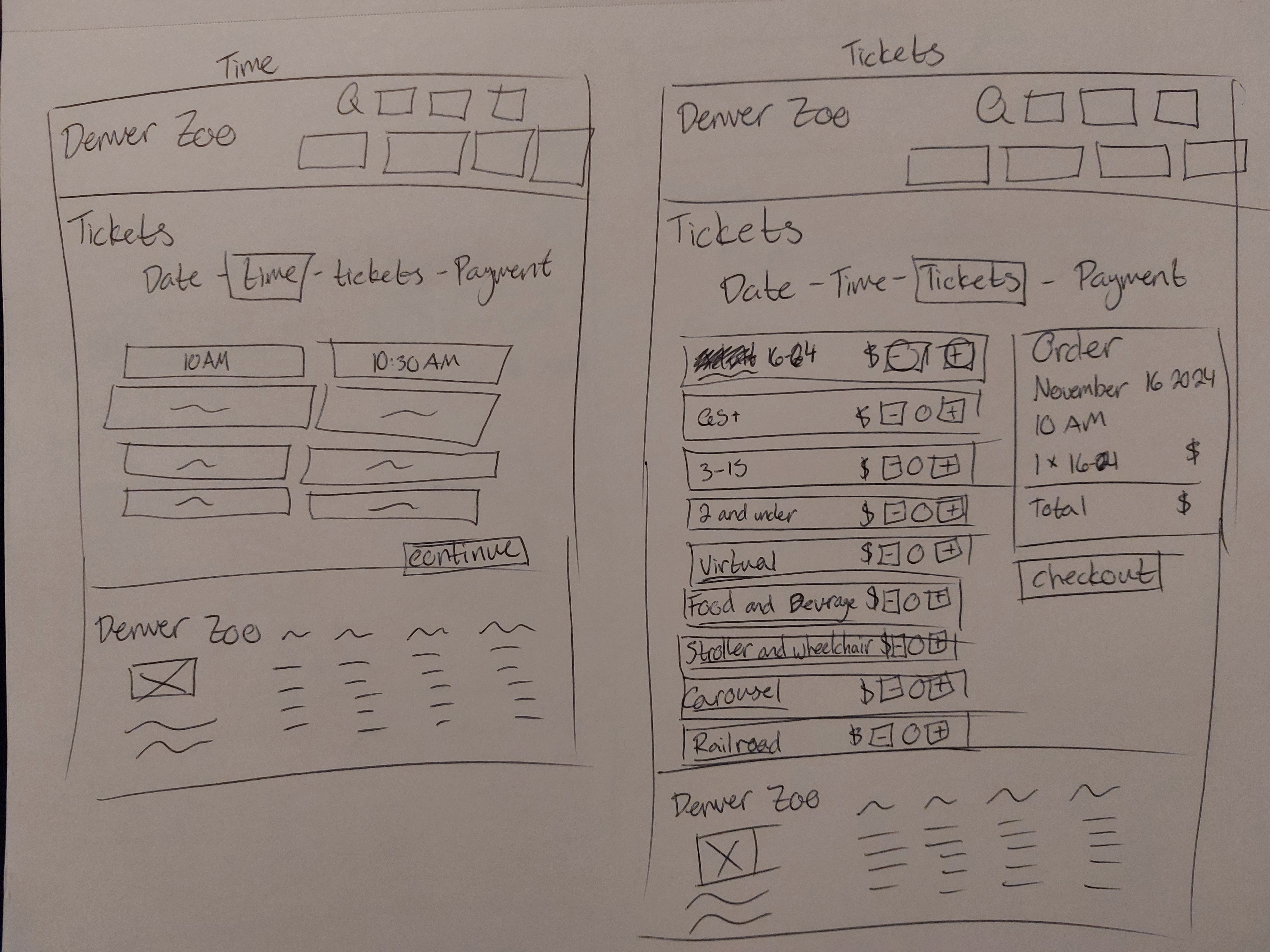
Time and tickets

Payment
I created a series of low-fidelity wireframes based on my user flow. The pen and paper wireframes show proposed home screen, and few pages in the purchase a ticket flow. Working in low fidelity makes it easier to ideate layout on the page and talk with advisors, before moving onto my mid-fidelity wireframes.
Mid fidelity wireframes
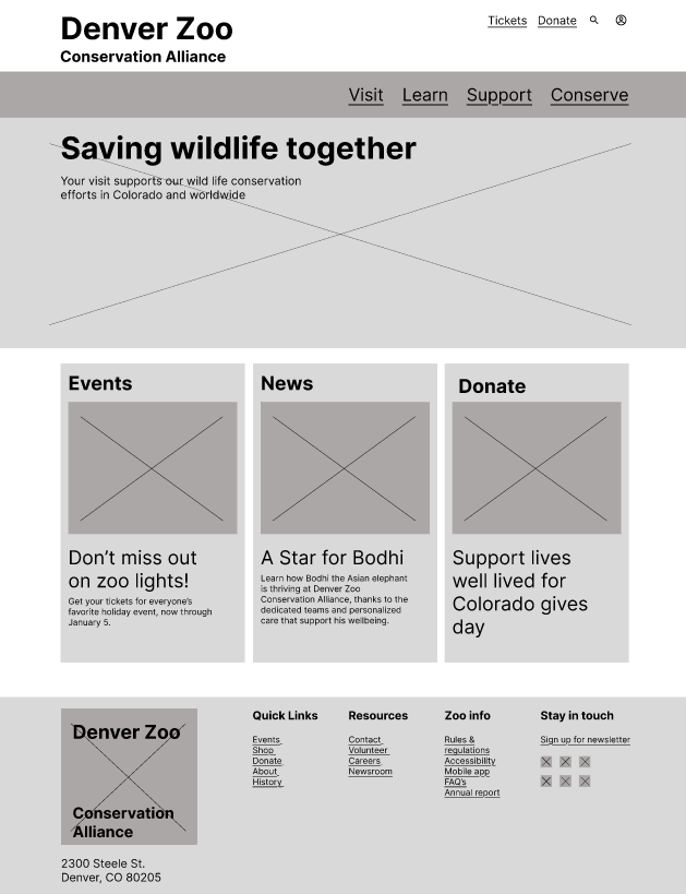
Home screen
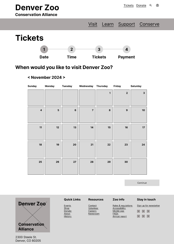
Date
Time
Tickets
Payment
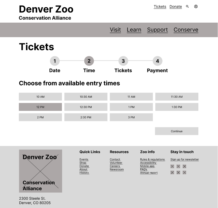
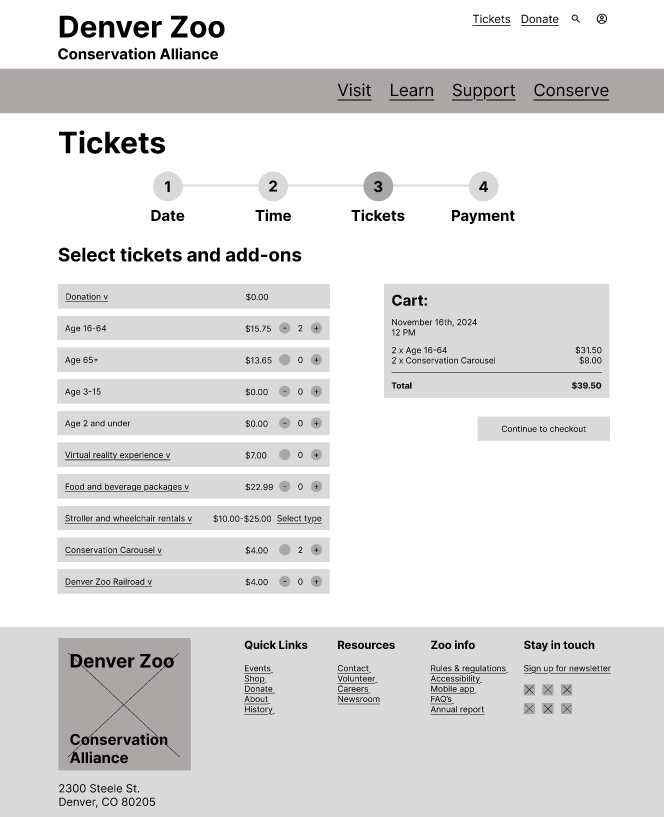
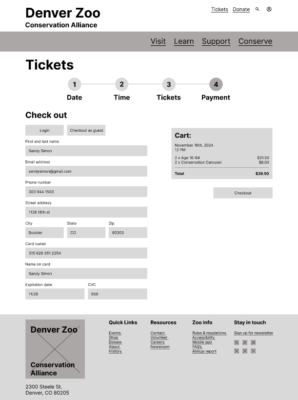
After gathering feedback on my low fidelity wireframes, I made a Figma Design File to create a set of mid-fidelity wireframes. The mid-fidelity version helps me see how content is laid out on an actual screen and contains placeholder content to get an idea of layout and feel of the new ticket flow purchase. In mid-fidelity, I could test the sizing of my elements and make changes to utilize the space better.
High fidelity wireframes
Home screen
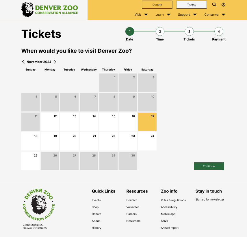
Date
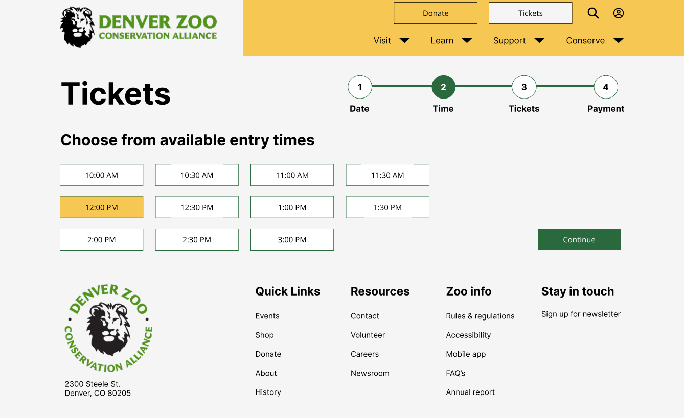
Time
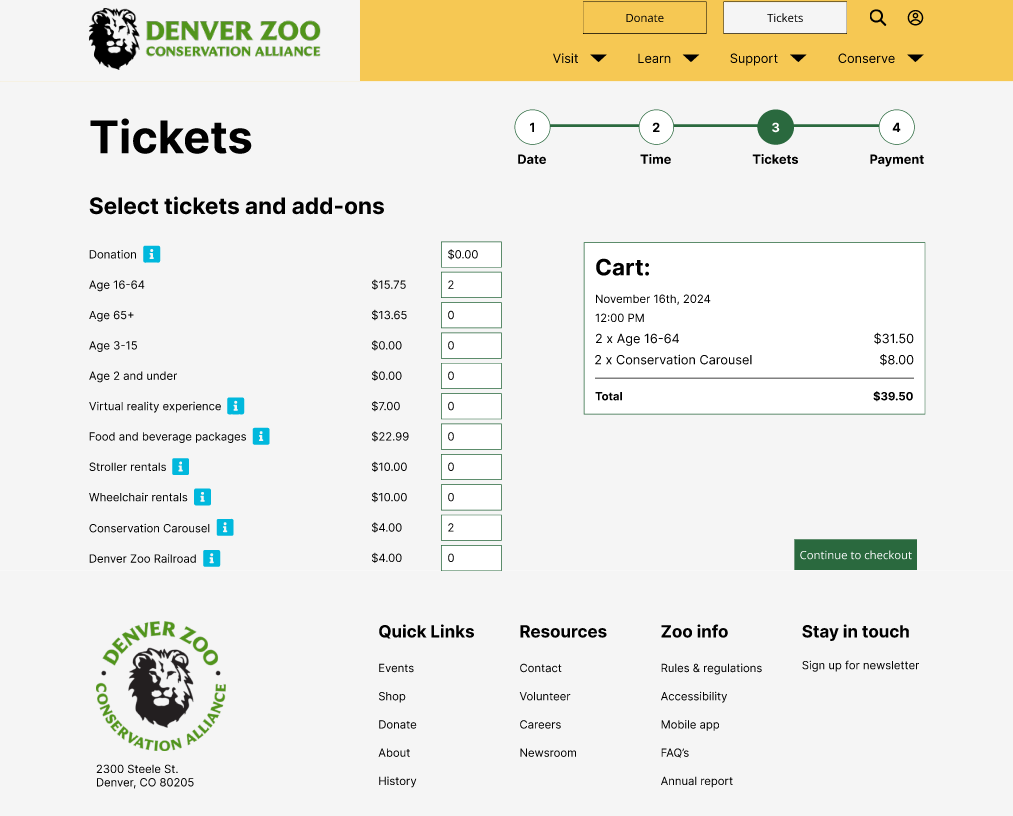
Tickets
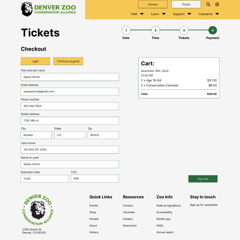
Payment
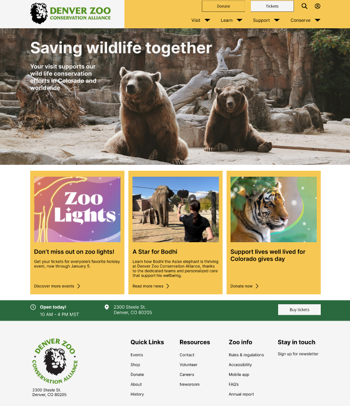
After analyzing feedback gained from my prototypes and design planning, I created my high-fidelity prototype in Figma. I used the same design system as the current Denver Zoo experience, including images and colors. For accessibility I made sure my prototype passes WCAG AA compliance guidelines. The new high-fidelity prototype is more simple for the user and includes a stepper to easier movement through the process.
Instructor feedback
Throughout this process, I received feedback from my instructor, Brittney Urich. Having her help throughout this process was very beneficial to my growth as a UX designer, by advising me to look at problems from a different perspective. I received feedback on my sizing, relevant information, and importance of color. I made sure in my final prototype to keep my body text to 16pt, header to 120pt, cut down my use of dividers, and made sure my color usage was purposeful.
Evaluation and results
After setting up my high fidelity wireframe, it was time for more user testing. I had a couple testers run through my prototype, to make sure it flowed nicely with fresh eyes and all important information was present. A pain point that came up multiple times was about not enough informational text.
To remedy this I will add text in the beginning of the ticket flow to explain ticket prices and what users are buying. Also adding clarifying text about tickets on the success screen. Also a thank you to the user for visiting the Denver Zoo's website and for planning a visit.
Future plans
This was my first UX case study and I enjoyed the process. My next steps would be to add to my UX skills by taking on another case study or take a certificate class. If I had more time on this project, I would have liked to do more user testing on a broader audience, explore typography, and additive design elements.
Conclusion
My key takeaways from this case study was the importance of process. This was my first case study and I learned a lot about user testing, research, and standard pixel sizing. Some key lessons are that not everyone is going to have the same opinion about design and that's okay. Also 16pt font is not too small, but just right.